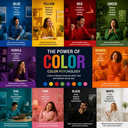
How the Colours Around You Shape Your Mood, and Why
Walk into a room painted a soft, sage green and something in you settles. Step into one washed in bright red and your pulse quietens or quickens, depending on the shade. This isn’t imagination or coincidence. Colour is light of different wavelengths hitting the eye, and the way our brains process that light is deeply tied to our nervous system, our hormones, and even our memories. Understanding colour psychology gives us a simple, accessible tool for shaping how we feel, in our homes, our clothing, and even the essential oils and remedies we reach for.
Why Colour Affects Mood at All
The science comes down to biology as much as culture. Light entering the eye doesn’t just let us see, it also signals the hypothalamus, the part of the brain that regulates hormones, sleep, appetite, and stress response. Certain wavelengths of light have been shown to influence the production of cortisol and melatonin, which is part of why warm, golden light in the evening helps us wind down, while cool, blue-toned light in the morning helps us wake. Layered on top of this biological response is a lifetime of learned association. Red may quicken the heart because it once meant danger, fire, or blood. Blue may calm because it echoes open sky and calm water. Every culture builds its own layer of meaning atop these shared instincts, which is why colour psychology is part universal, part personal, and part cultural.
A Guide to the Emotional Language of Colour
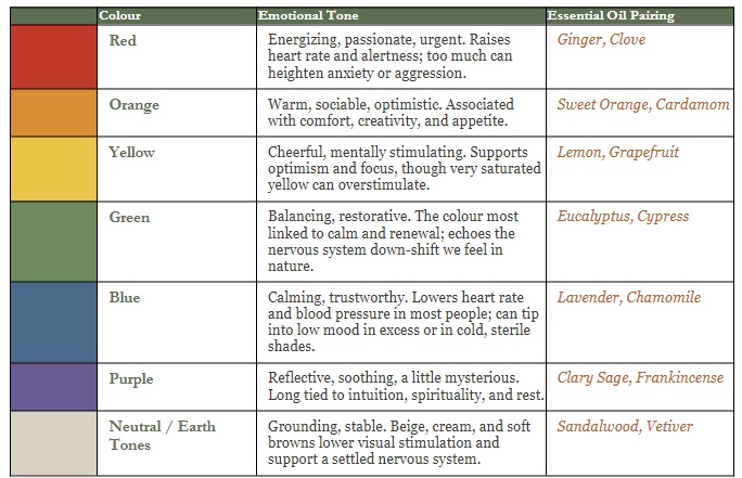
Below is a quick reference for the emotional tone most people associate with each colour family, along with an essential oil that echoes a similar mood, should you want to pair scent and colour with intention.
Colour in Practice: Using It With Intention
Once you understand the emotional undertones of colour, you can start using it deliberately rather than by accident. A bedroom that leans into soft blues and greens supports the wind-down that good sleep requires. A home office benefits from a touch of yellow or orange to keep mental energy up without tipping into overstimulation. A therapy or treatment room, the kind many of us build for bodywork, reflexology, or energy work, tends to do best in sage greens, soft neutrals, and muted golds: colours that lower the nervous system’s guard so the body can actually receive the work being done.
The same principle applies to what you wear, the flowers you keep in a room, or even the plate you eat from. Colour is a constant, quiet input, and small, intentional choices add up over a day.
Where Colour and Scent Meet
In holistic practice, colour and aroma are often treated as two expressions of the same underlying idea, an emotional frequency, if you like, or simply a shared association built over centuries of human experience. Lavender is calming partly because of its chemistry and partly because we associate its soft violet-blue with rest. Citrus oils feel uplifting in a way that echoes the same energy as their bright yellows and oranges. Pairing colour and scent intentionally, a sage green room with eucalyptus, a warm terracotta space with ginger and clove, can reinforce the mood you’re working to create rather than leaving it to chance.
The Vibration of What You Wear
In energy work, colour isn’t just something you see, it’s something you’re wearing as frequency. Brighter, lighter colours vibrate faster and tend to lift your energy and the energy of a room: a saffron yellow or a clear turquoise practically hums, inviting connection and visibility. Deeper, warmer tones like terracotta and forest green vibrate more slowly and steady you, which is why they feel so right for grounding, restorative days.
Black sits at its own end of the spectrum. Rather than reflecting light back out the way brighter colours do, black absorbs it, which is part of why wearing it can feel protective, private, and quieting, like pulling on a bit of armour. Many people reach for black on days they want to conserve energy, feel less exposed, or simply move through the world without inviting extra attention. There’s nothing wrong with that. It’s simply a slower, more introverted frequency, worn on purpose.
And yes, black is famous for its slimming effect. It may narrow your silhouette in the mirror, but it won’t narrow your aura, energetically you still take up just as much space in the room. So wear it for the calm, wear it for the quiet, just don’t expect it to do any vibrational Spanx work on your energy field.
White sits at the opposite end. Rather than absorbing light the way black does, white reflects nearly all of it back, which is why it’s long been worn as a symbol of clarity, purity, and new beginnings, think weddings, christenings, and the crisp coats of healers and clinicians. Energetically, white is said to carry the full, unfiltered spectrum at once, which can feel amplifying and cleansing, like hitting a soft reset. Many people notice they feel lighter, calmer, and a touch more open in white, as though it clears a little static before the day even starts.
Fun Facts About Colour and the Mind
- Every colour is really a different frequency of light vibrating at its own rate, red being the slowest and longest wave, violet the fastest and shortest, which is part of why energy healers treat colour as a vibrational tool, not just a visual one.
- The colour you wear acts a bit like a mood broadcast: red is worn for confidence and power, blue for trust and calm, and studies on “the colour of clothing” show it can shift both how others perceive you and how you feel in your own body.
- Many faiths dress their ceremonies in deliberate colour: white for purity and new beginnings, red for sacrifice, passion, or vitality, and gold or purple for divinity and royalty, using colour as a wordless signal of the mood or meaning of the moment.
- Drunk Tank Pink is a real shade used in some jail holding cells because pink has been shown to measurably lower aggression in the people exposed to it.
- Blue is the most universally liked colour across cultures, likely because it echoes the safety of open sky and clear water.
The Takeaway
Colour is not decoration alone. It’s a form of communication your nervous system is reading whether you intend it to or not. Once you start paying attention to which colours calm you, which energize you, and which simply feel like home, you gain a small but genuinely useful tool for shaping your own wellbeing, one room, one outfit, one bottle of essential oil at a time.